目前,响应式网页布局有5种模式:mostly fluid , column drop , layout shifter , tiny tweaks , off canvas
目前,响应式网页布局有5种模式:
- mostly fluid
- column drop
- layout shifter
- tiny tweaks
- off canvas
我们使用flexbox(弹性盒子)来讲解,我们使用一个主div,在这个主div下包含有多个div,用这几个div来讲解一下这5种模式。
【关于flexbox弹性盒子请查看《CSS3 flexbox弹性盒模型》】
一、Mostly Fluid
1
2
3
4
5
6
7
8
9
10
11
12
13
14
| <!DOCTYPE html>
<html>
<head>
</head>
<body>
<div class="container" role="main">
<div class="c1"></div>
<div class="c2"></div>
<div class="c3"></div>
<div class="c4"></div>
<div class="c5"></div>
</div>
</body>
</html>
|
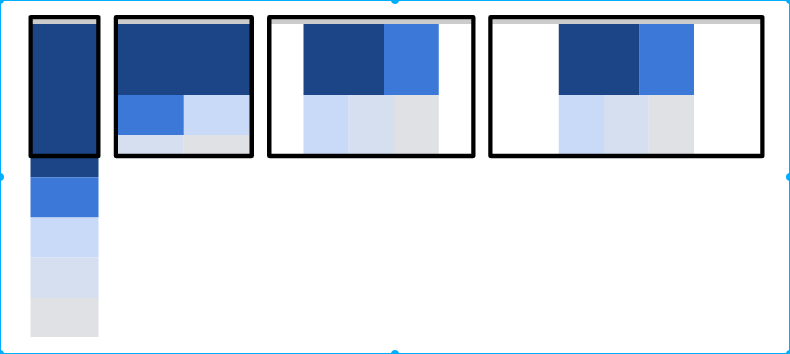
最终效果共4种情况:
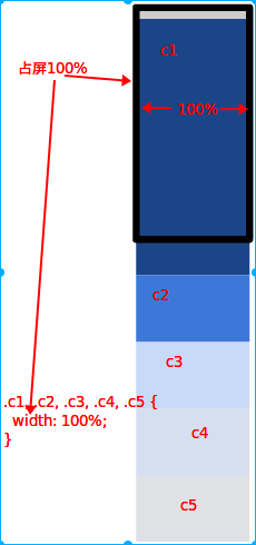
首先在作为主div(main div)上设置样式,这个主div我们称它为容器container
1
2
3
4
5
6
7
8
9
10
11
12
13
14
15
16
17
18
19
20
21
22
23
24
25
26
27
28
29
30
31
32
33
34
35
36
37
38
39
40
41
42
43
44
45
46
47
48
49
|
.container {
display: -webkit-flex;
display: flex;
-webkit-flex-flow: row wrap;
flex-flow: row wrap;
}
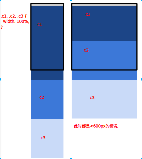
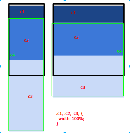
.c1, .c2, .c3, .c4, .c5 {
width: 100%;
}
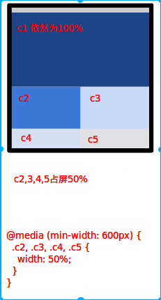
@media (min-width: 600px) {
.c2, .c3, .c4, .c5 {
width: 50%;
}
}
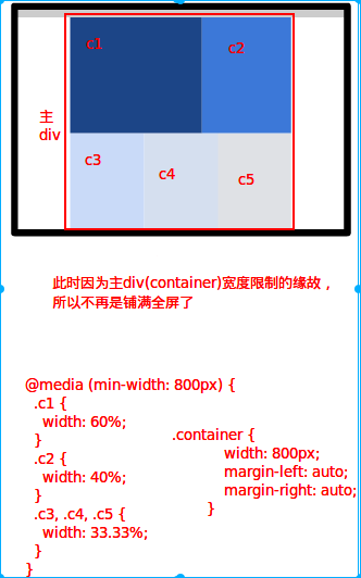
@media (min-width: 800px) {
.container {
width: 800px;
margin-left: auto;
margin-right: auto;
}
.c1 {
width: 60%;
}
.c2 {
width: 40%;
}
.c3, .c4, .c5 {
width: 33.33%;
}
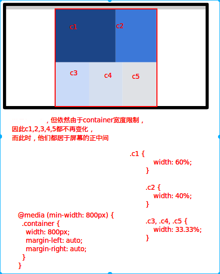
玫红
}
|
查看效果
浏览器宽度<600px:
600px<=浏览器宽度<800px:
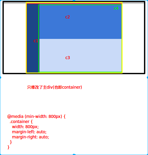
800px<=浏览器宽度:
800px<=浏览器宽度:
参考和练习,可以模式下面的网站自己做一次
二、Column Drop
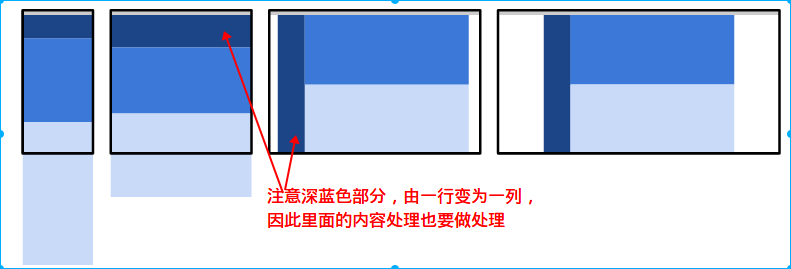
此模式是对于需要实现 全宽度多列显示 的布局。当浏览器窗口太窄时,各列将会垂直排列(如下面第一张图)
为此布局模式设置宽度范围断点时,要根据内容并且要将针对其他设计而改变。
最终效果共4种情况:
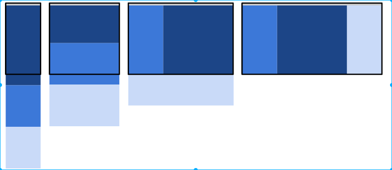
查看效果
1
2
3
4
5
6
7
8
9
10
11
12
| <!DOCTYPE html>
<html>
<head>
</head>
<body>
<div class="container" role="main">
<div class="c1"></div>
<div class="c2"></div>
<div class="c3"></div>
</div>
</body>
</html>
|
1
2
3
4
5
6
7
8
9
10
11
12
13
14
15
16
17
18
19
20
21
22
23
24
25
26
27
28
29
30
31
32
33
34
35
36
37
38
39
40
41
42
43
44
|
.container {
display: -webkit-flex;
display: flex;
-webkit-flex-flow: row wrap;
flex-flow: row wrap;
}
.c1, .c2, .c3 {
width: 100%;
}
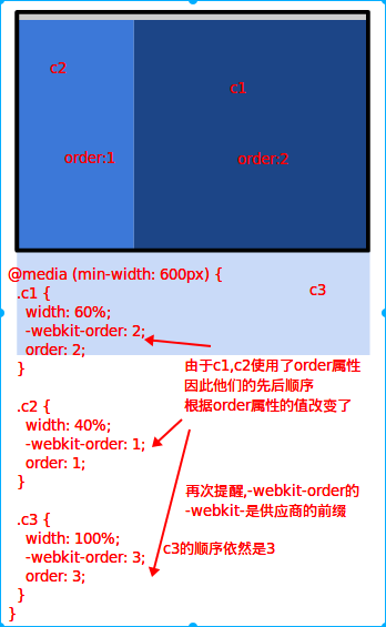
@media (min-width: 600px) {
.c1 {
width: 60%;
-webkit-order: 2;
order: 2;
}
.c2 {
width: 40%;
-webkit-order: 1;
order: 1;
}
.c3 {
width: 100%;
-webkit-order: 3;
order: 3;
}
}
@media (min-width: 800px) {
.c2 {
width: 20%;
}
.c3 {
width: 20%;
}
}
|
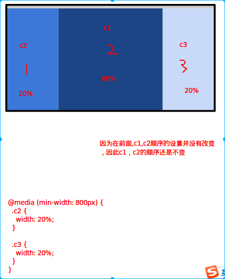
浏览器宽度<600px:
600px<=浏览器宽度<800px:注意浅蓝色c3那块
800px<=浏览器宽度:
参考和练习,可以模式下面的网站自己做一次
三、Layout Shifter
该模式比较复杂,因为会涉及元素里的内容的更改,而不只是总体内容布局的更改。
查看效果
1
2
3
4
5
6
7
8
9
10
11
12
13
14
15
| <!DOCTYPE html>
<html>
<head>
</head>
<body>
<div class="container" role="main">
<div class="c1"></div>
<div class="c4">
<div class="c2"></div>
<div class="c3"></div>
</div>
</div>
</body>
</html>
|
1
2
3
4
5
6
7
8
9
10
11
12
13
14
15
16
17
18
19
20
21
22
23
24
25
26
27
28
29
30
31
32
|
.container {
display: -webkit-flex;
display: flex;
-webkit-flex-flow: row wrap;
flex-flow: row wrap;
}
.c1, .c2, .c3, .c4 {
width: 100%;
}
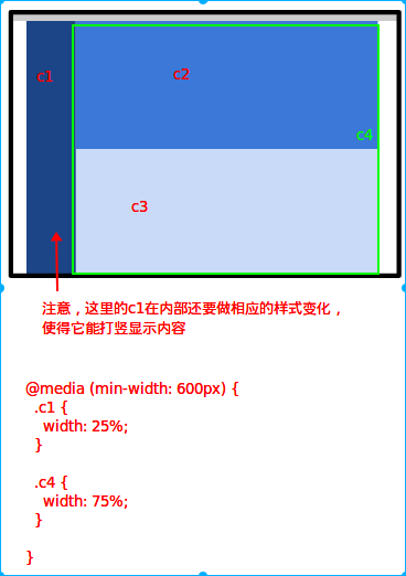
@media (min-width: 600px) {
.c1 {
width: 25%;
}
.c4 {
width: 75%;
}
}
@media (min-width: 800px) {
.container {
width: 800px;
margin-left: auto;
margin-right: auto;
}
}
|
浏览器宽度<=600px时
600px<=浏览器宽度<800px
800px<=浏览器宽度
参考和练习,可以模式下面的网站自己做一次
四、Tiny Tweaks
Tiny tweaks 模式只对布局进行很小的更改,例如调整字号,调整图片大小或对内容进行极微的移动。在屏幕大小改变时,本模式的变化很小。当屏幕宽度增加时,字号和行距也变大。
查看效果
1
2
3
4
5
6
7
8
9
10
11
12
13
14
| <!DOCTYPE html>
<html>
<head>
</head>
<body>
<div class="container" role="main">
<div class="c1">
<p>paragraph1</p>
<p>paragraph2</p>
<p>paragraph3</p>
</div>
</div>
</body>
</html>
|
1
2
3
4
5
6
7
8
9
10
11
12
13
14
15
16
17
18
19
20
21
|
.c1 {
padding: 10px;
width: 100%;
}
@media (min-width: 500px) {
.c1 {
padding: 20px;
font-size: 1.5em;
}
}
@media (min-width: 800px) {
.c1 {
padding: 40px;
font-size: 2em;
}
}
|
参考和练习,可以模式下面的网站自己做一次
五、Off Canvas
该模式需要知道并且掌握transform属性、position定位属性怎么使用
off canvas 模式不是垂直排列内容,而是将不 常用的内容(可能是导航或应用的菜单)放在屏幕之外,只在屏幕足够大时才显示。在较小屏幕上,只需点击 就能显示内容。
此示例不是垂直排列内容,而是使用transform: translate(-250px, 0) 将两个内容 div隐藏在屏幕之外。 然后通过给元素添加 .open 类来使其可见,使用 JavaScript 来显示这些 div。 当屏幕变宽时,从元素中去掉屏幕外的绝对定位,并且让它显示在可见视口内。
注意,在本例中,Safari for iOS 6 和安卓浏览器不支持 flexbox 的flex-flow: row nowrap 功能,因此我们必须使用绝对定位来实现。
查看效果
1
2
3
4
5
6
7
8
9
| <body>
<div class="container" role="main">
<div class="c1 open" id="leftDrawer"></div>
<div class="c2" id="mainPanel">
hello
</div>
<div class="c3" id="rightDrawer"></div>
</div>
</body>
|
1
2
3
4
5
6
7
8
9
10
11
12
13
14
15
16
17
18
19
20
21
22
23
24
25
26
27
28
29
30
31
32
33
34
35
36
37
38
39
40
41
42
43
44
45
46
47
48
49
50
51
52
53
54
55
56
57
58
59
60
61
62
63
64
65
66
67
68
69
70
71
72
73
74
75
76
77
78
79
80
81
82
|
body {
overflow-x: hidden;
}
.container {
display: block;
}
.c1, .c3 {
position: absolute;
width: 250px;
height: 100%;
-webkit-backface-visibility: hidden;
backface-visibility: hidden;
-webkit-transition: -webkit-transform 0.4s ease-out;
transition: transform 0.4s ease-out;
z-index: 1;
}
.c1 {
-webkit-transform: translate(-250px,0);
transform: translate(-250px,0);
}
.c2 {
width: 100%;
position: absolute;
}
.c3 {
left: 100%;
}
.c1.open {
-webkit-transform: translate(0,0);
transform: translate(0,0);
}
.c3.open {
-webkit-transform: translate(-250px,0);
transform: translate(-250px,0);
}
@media (min-width: 500px) {
.container {
display: -webkit-flex;
display: flex;
-webkit-flex-flow: row nowrap;
flex-flow: row nowrap;
}
.c1 {
position: relative;
-webkit-transition: none 0s ease-out;
transition: none 0s ease-out;
-webkit-transform: translate(0,0);
transform: translate(0,0);
}
.c2 {
position: static;
}
}
@media (min-width: 800px) {
body {
overflow-x: auto;
}
.c3 {
position: relative;
left: auto;
-webkit-transition: none 0s ease-out;
transition: none 0s ease-out;
-webkit-transform: translate(0,0);
transform: translate(0,0);
}
}
|
参考和练习,可以模式下面的网站自己做一次
本文参考:https://developers.google.com/web/fundamentals/design-and-ui/responsive/patterns/?hl=zh-cn